子供が二人とも風邪っぴきで、家族そろって引きこもりの週末。
ただ引きこもって子供の相手をしているのも勿体無い気がして、勉強しながら娘の遊び相手をするなんて無謀なことしてました。
実際できたのは、実践 Python データサイエンス 12.アレイを使ったデータ処理で教わった内容を、手を動かして確認する程度でした…。
Udemy動画でも突然出てくるmeshgrid関数。
In [20]: a, b = np.meshgrid([0,1,2,3,4], [5,6,7])
In [21]: a
Out[21]:
array([[0, 1, 2, 3, 4],
       [0, 1, 2, 3, 4],
       [0, 1, 2, 3, 4]])
In [22]: b
Out[22]:
array([[5, 5, 5, 5, 5],
       [6, 6, 6, 6, 6],
       [7, 7, 7, 7, 7]])
返る結果を見れば内部処理もだいたい分かるでしょと言われればそれまでですが、【Python】ふたつの配列からすべての組み合わせを評価を参考にtile関数で同じことをやってみると更に納得感が得られます。
meshgrid関数のヘルプを見ても何のことやらよくわからんのですが、
Signature: np.meshgrid(*xi, **kwargs)
Docstring:
Return coordinate matrices from coordinate vectors.
Make N-D coordinate arrays for vectorized evaluations of
N-D scalar/vector fields over N-D grids, given
one-dimensional coordinate arrays x1, x2,..., xn.
...
meshgrid関数同等のことをtile関数で試してみるとよく分かります。
In [30]: np.tile([0,1,2,3,4], (len([5,6,7]), 1))
Out[30]:
array([[0, 1, 2, 3, 4],
       [0, 1, 2, 3, 4],
       [0, 1, 2, 3, 4]])
In [31]: np.tile([5,6,7], (len([0,1,2,3,4]), 1))
Out[31]:
array([[5, 6, 7],
       [5, 6, 7],
       [5, 6, 7],
       [5, 6, 7],
       [5, 6, 7]])
In [34]: np.tile([5,6,7], (len([0,1,2,3,4]), 1)).transpose()
Out[34]:
array([[5, 5, 5, 5, 5],
       [6, 6, 6, 6, 6],
       [7, 7, 7, 7, 7]])
このmeshgrid関数を使って、以下のように適当なデータを用意して可視化するのが、Udemy動画のSection3 numpyを知ろう: 12.アレイを使ったデータ処理です。
In [1]: import numpy as np
In [3]: import matplotlib.pyplot as plt
In [4]: plt.show()
In [6]: points = np.arange(-10,10,0.01)
In [7]: dx, dy = np.meshgrid(points, points)
In [8]: dx
Out[8]:
array([[-10.  ,  -9.99,  -9.98, ...,   9.97,   9.98,   9.99],
       [-10.  ,  -9.99,  -9.98, ...,   9.97,   9.98,   9.99],
       [-10.  ,  -9.99,  -9.98, ...,   9.97,   9.98,   9.99],
       ...,
       [-10.  ,  -9.99,  -9.98, ...,   9.97,   9.98,   9.99],
       [-10.  ,  -9.99,  -9.98, ...,   9.97,   9.98,   9.99],
       [-10.  ,  -9.99,  -9.98, ...,   9.97,   9.98,   9.99]])
In [9]: dy
Out[9]:
array([[-10.  , -10.  , -10.  , ..., -10.  , -10.  , -10.  ],
       [ -9.99,  -9.99,  -9.99, ...,  -9.99,  -9.99,  -9.99],
       [ -9.98,  -9.98,  -9.98, ...,  -9.98,  -9.98,  -9.98],
       ...,
       [  9.97,   9.97,   9.97, ...,   9.97,   9.97,   9.97],
       [  9.98,   9.98,   9.98, ...,   9.98,   9.98,   9.98],
       [  9.99,   9.99,   9.99, ...,   9.99,   9.99,   9.99]])
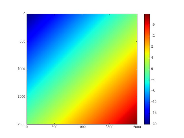
Udemy動画では、これらのデータをいきなり三角関数かまして可視化していくんですが、試しにこれらをそのまま可視化してみると、面白みに欠けるからそうしたんだな、ということが分かります。
In [60]: dx + dy
Out[60]:
array([[ -2.00000000e+01,  -1.99900000e+01,  -1.99800000e+01, ...,
         -3.00000000e-02,  -2.00000000e-02,  -1.00000000e-02],
       [ -1.99900000e+01,  -1.99800000e+01,  -1.99700000e+01, ...,
         -2.00000000e-02,  -1.00000000e-02,  -4.24549285e-13],
       [ -1.99800000e+01,  -1.99700000e+01,  -1.99600000e+01, ...,
         -1.00000000e-02,  -4.26325641e-13,   1.00000000e-02],
       ...,
       [ -3.00000000e-02,  -2.00000000e-02,  -1.00000000e-02, ...,
          1.99400000e+01,   1.99500000e+01,   1.99600000e+01],
       [ -2.00000000e-02,  -1.00000000e-02,  -4.26325641e-13, ...,
          1.99500000e+01,   1.99600000e+01,   1.99700000e+01],
       [ -1.00000000e-02,  -4.24549285e-13,   1.00000000e-02, ...,
          1.99600000e+01,   1.99700000e+01,   1.99800000e+01]])
In [61]: plt.imshow(dx+dy)
Out[61]: <matplotlib.image.AxesImage at 0x1484a9be0>
In [62]: plt.colorbar()
Out[62]: <matplotlib.colorbar.Colorbar at 0x1484fa400>
In [63]: plt.savefig("dx+dy.png")
In [64]: dx * dy
Out[64]:
array([[ 100.    ,   99.9   ,   99.8   , ...,  -99.7   ,  -99.8   ,  -99.9   ],
       [  99.9   ,   99.8001,   99.7002, ...,  -99.6003,  -99.7002,
         -99.8001],
       [  99.8   ,   99.7002,   99.6004, ...,  -99.5006,  -99.6004,
         -99.7002],
       ...,
       [ -99.7   ,  -99.6003,  -99.5006, ...,   99.4009,   99.5006,
          99.6003],
       [ -99.8   ,  -99.7002,  -99.6004, ...,   99.5006,   99.6004,
          99.7002],
       [ -99.9   ,  -99.8001,  -99.7002, ...,   99.6003,   99.7002,
          99.8001]])
In [67]: plt.imshow(dx*dy)
Out[67]: <matplotlib.image.AxesImage at 0x1500a8550>
In [68]: plt.colorbar()
Out[68]: <matplotlib.colorbar.Colorbar at 0x1500f1e10>
In [69]: plt.savefig("dxbydy.png")

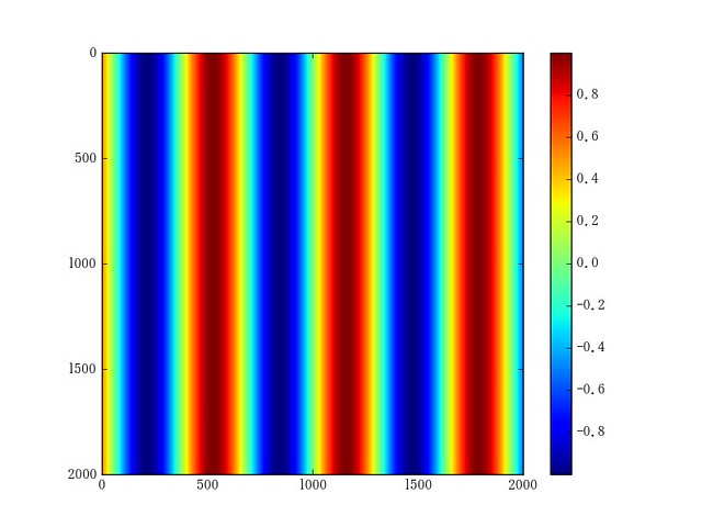
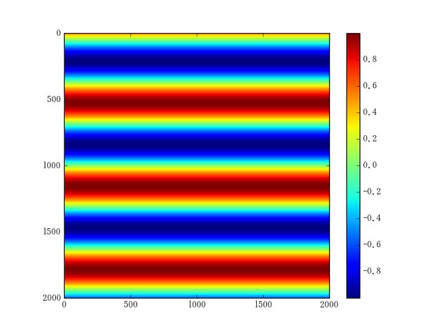
そこで、Udemy動画のようにdx, dyに三角関数かますと、以下のように-1.0〜1.0間での周期的な変化となって…
In [71]: plt.imshow(np.sin(dx))
Out[71]: <matplotlib.image.AxesImage at 0x11217bf28>
In [72]: plt.colorbar()
Out[72]: <matplotlib.colorbar.Colorbar at 0x11259d780>
In [73]: plt.savefig("sin_dx.png")
In [75]: plt.imshow(np.sin(dy))
Out[75]: <matplotlib.image.AxesImage at 0x1127f5f60>
In [76]: plt.colorbar()
Out[76]: <matplotlib.colorbar.Colorbar at 0x112846780>
In [77]: plt.savefig("sin_dy.png")
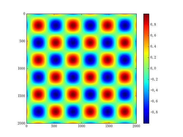
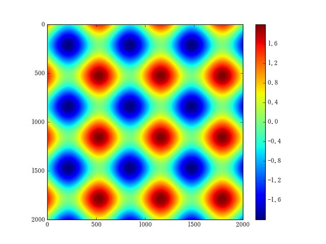
二次元平面上を周期的に変化するようになるので、それらの和や積を可視化してみると、Udemy動画の通り~~気持ち悪い~~面白い画になります。
In [15]: plt.imshow(np.sin(dx) + np.sin(dy))
Out[15]: <matplotlib.image.AxesImage at 0x129137c88>
In [16]: plt.savefig("sin+sin.png")
In [10]: plt.imshow(np.sin(dx) * np.sin(dy))
Out[10]: <matplotlib.image.AxesImage at 0x112148b38>
In [11]: plt.savefig("sinxsin.png")